
Overview
Clear Skincare Clinics operates 90+ locations across Australia and New Zealand. Clinic discovery sat at a critical junction between treatment consideration and booking, yet the existing experience functioned as a static directory rather than a conversion-focused product feature.
Users could browse clinics alphabetically or by postcode, but:
• The experience was not mobile optimised
• There was no indication of which treatments were available at each location
• Users often entered the booking flow before discovering their selected clinic did not offer their desired service
• This created unnecessary friction and increased drop-off at a key decision point.
• There was no indication of which treatments were available at each location
• Users often entered the booking flow before discovering their selected clinic did not offer their desired service
• This created unnecessary friction and increased drop-off at a key decision point.
The Challenge
The existing finder created friction at a critical decision point:
• Long alphabetical/postcode lists were difficult to scan
• Poor mobile usability
• No contextual awareness (e.g. nearest clinic)
• No visibility into which treatments were available at each location
• Multiple steps between finding a clinic and booking
• Not all clinics offered the same treatments, yet users had no way of confirming service availability before entering the booking flow. This led to confusion, unnecessary navigation and potential drop-off.
My Role
I led the end-to-end UX/UI design of a new location finder, working within the constraints of the existing CMS and booking platform. The solution needed to be mobile-first, scalable and technically feasible without a full rebuild.
Design Requirements
• Reduce friction in clinic discovery
• Prioritise mobile usability
• Surface treatment availability at the clinic level
• Integrate geolocation and manual search
• Connect directly to the booking flow
• Support future clinic expansion
• Work within the existing CMS architecture
• Prioritise mobile usability
• Surface treatment availability at the clinic level
• Integrate geolocation and manual search
• Connect directly to the booking flow
• Support future clinic expansion
• Work within the existing CMS architecture
The Solution:
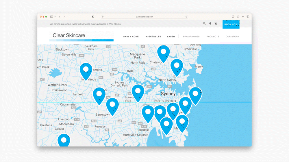
I redesigned the finder as a geolocation-led, map-based experience that surfaces relevant clinics instantly and aligns clinic selection with treatment intent.
Key UX Decisions
Geolocation First
Users can auto-detect their location to see nearby clinics immediately, reducing cognitive load and search time.
Users can auto-detect their location to see nearby clinics immediately, reducing cognitive load and search time.
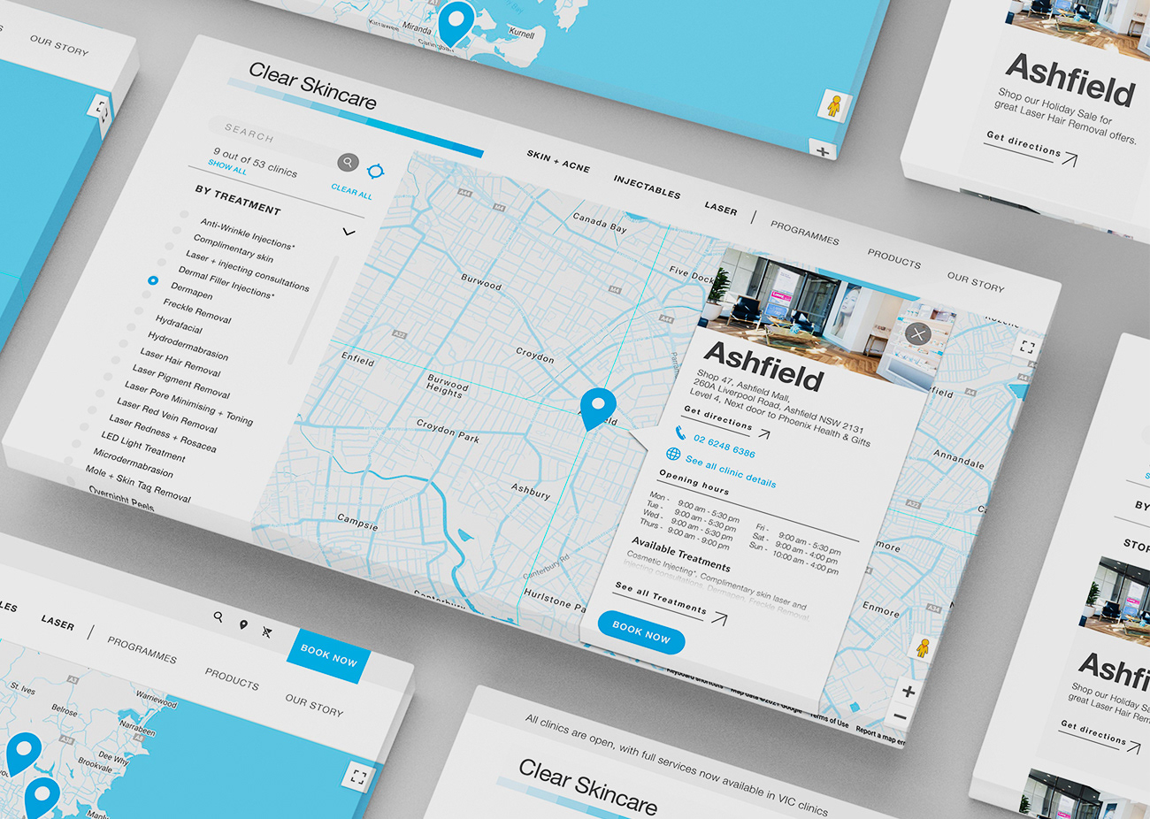
Treatment-Level Visibility
Clinic cards clearly display available treatments, allowing users to validate suitability before proceeding. Filters enable users to refine results based on specific services.
Clinic cards clearly display available treatments, allowing users to validate suitability before proceeding. Filters enable users to refine results based on specific services.
Map + List Hybrid UI
An interactive Google Map paired with structured clinic cards provides both spatial awareness and scannable hierarchy.
An interactive Google Map paired with structured clinic cards provides both spatial awareness and scannable hierarchy.
Information at a Glance
Each card surfaces essential details — address, contact, hours and available treatments — supporting faster decision-making.
Each card surfaces essential details — address, contact, hours and available treatments — supporting faster decision-making.
Direct Booking Integration
Users can move straight into the appointment flow from the finder, reducing drop-off between discovery and action.
Users can move straight into the appointment flow from the finder, reducing drop-off between discovery and action.
Outcome
The redesigned finder repositioned clinic discovery as a contextual, conversion-aware product feature. By surfacing treatment availability upfront and shortening the path to booking, the experience reduced friction at a key conversion moment and better aligned with real user behaviour.