The Context
Clear Skincare Clinic (CSC) needed to modernise their website to address poor mobile usability, confusing navigation, and outdated content, impacting user experience and potential conversions.
This project employed a two-phased agile approach: Phase 1 focused on the homepage and navigation, while Phase 2 addressed treatment and concern page templates. This phased approach, combined with agile methodologies, allowed us to iterate on the design and development in manageable stages. While Phase 1 was in development and testing, we were able to begin design work on Phase 2, incorporating learnings and feedback from the initial phase to refine subsequent templates.
The Challenge:
The existing desktop-centric design resulted in a cluttered design, poor mobile functionality, hidden navigation elements (key navigation below the fold) and unclear information architecture, hindering users from easily finding treatments and booking appointments.
Key user insights revealed:
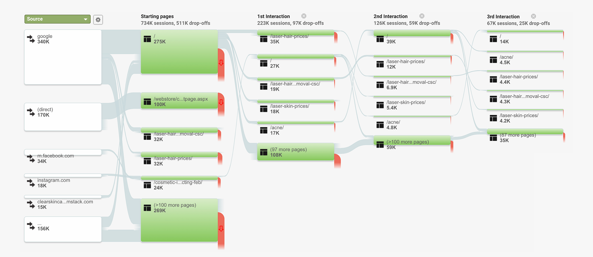
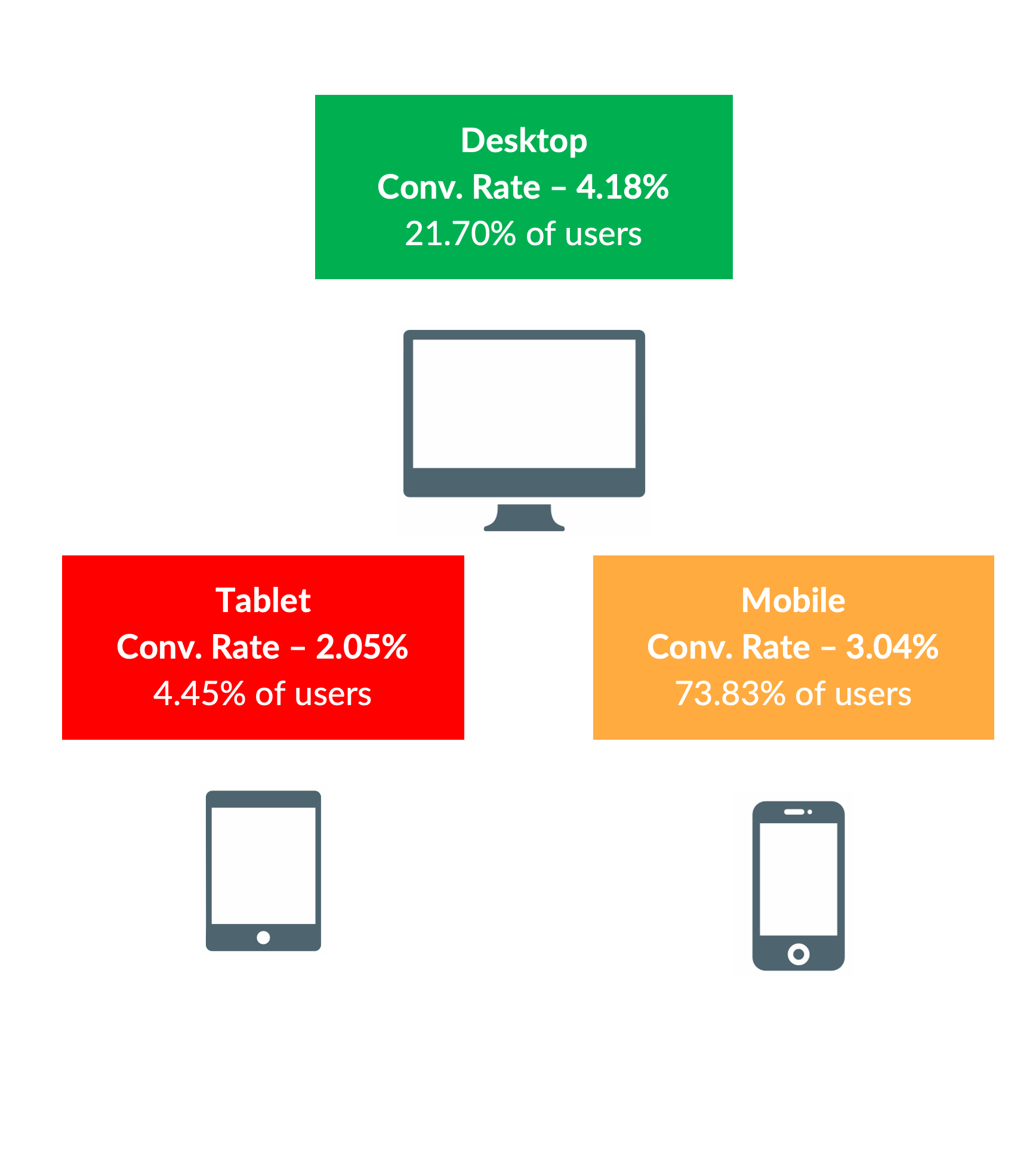
• Mobile-First Audience: Over 70% of users accessed the site via mobile.
• High Bounce Rate: Significant drop-off on the homepage due to slow site speed and poor navigation.
• Primary Traffic Sources: Google (organic) and social media ads.
• High Bounce Rate: Significant drop-off on the homepage due to slow site speed and poor navigation.
• Primary Traffic Sources: Google (organic) and social media ads.
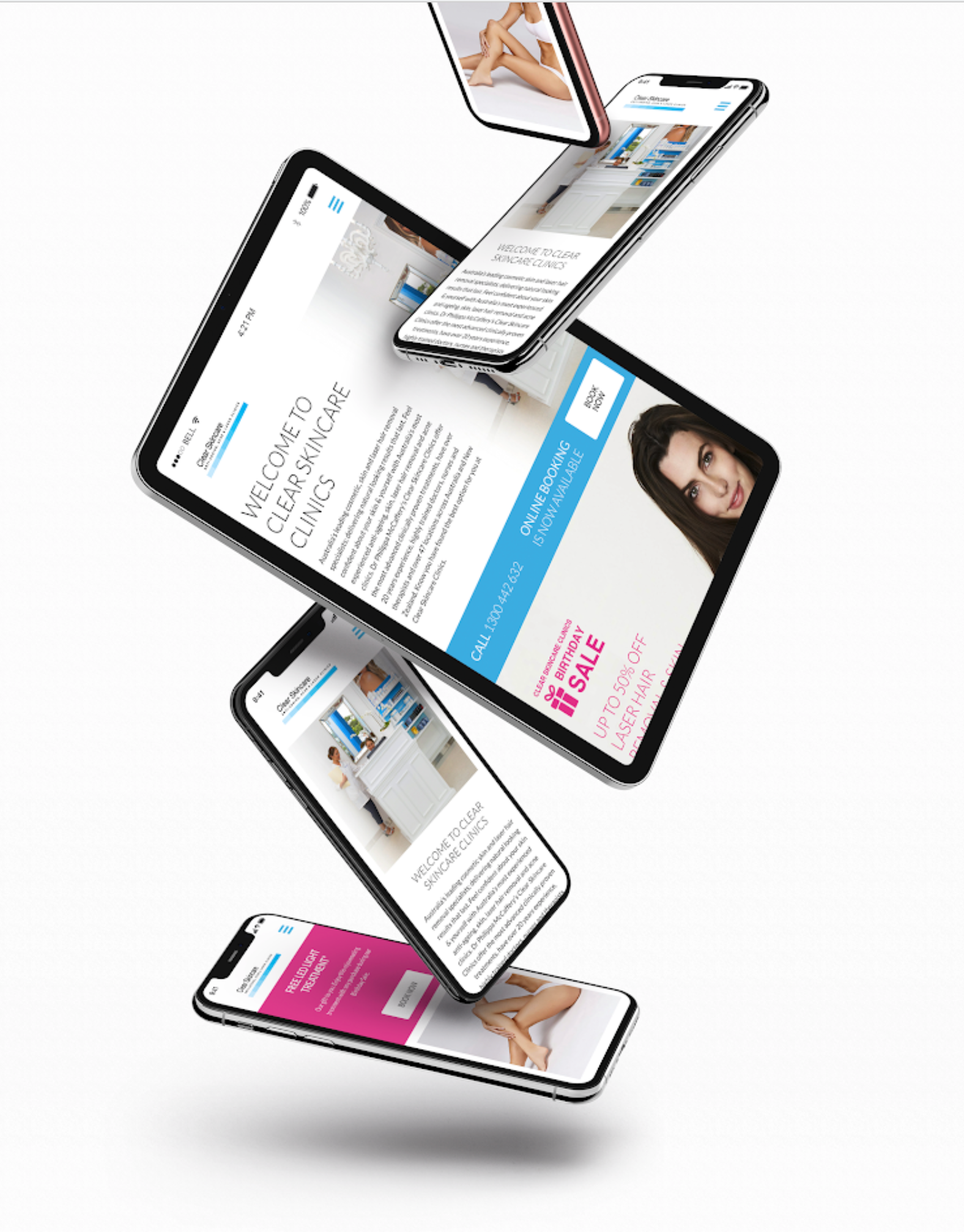
Initial site on mobile devices

Initial Acne page

original Homepage


My Role
As part of the UEC team, I contributed to the UX/UI design and content strategy across both phases of the CSC website redesign. My responsibilities included:
• Auditing and testing the initial website to reveal key insights to help define design goals that addressed user needs and business objectives.
• Collaborating with and mentoring other designers.
• Designing Lo to Hi fidelity wireframes using Figma.
• Creating interactive using prototypes.
• Designing the design system in Figma so all assets are scalable, unified and on brand
• Development handoff, including markups and commentary using Bugherd.
Project Goals:
• Create an industry-leading mobile-first skin clinic website.
• Significantly improve website performance.
• Increase website usability, dwell time, and conversions while reducing bounce rate.
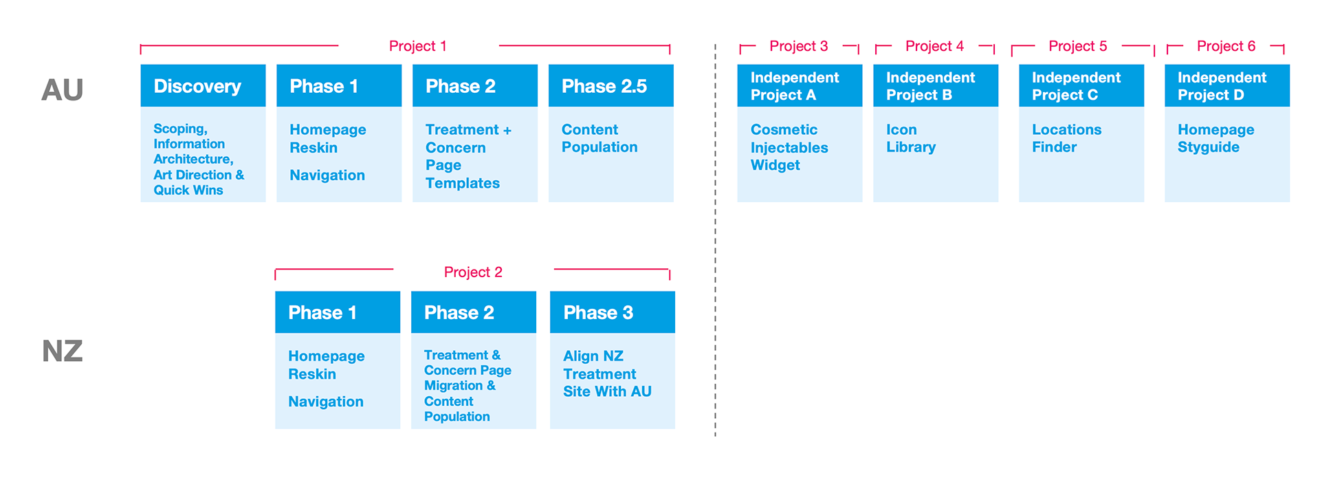
Project Sprints
Phase 1:
User Interface Art Direction and Design
This includes all key interactions of the website, all key templates and all modules to be used for every page.
• Art Direction
• Navigation UI Design for mobile and desktop
• Design System including typography, forms/inputs, grids, breakpoints and image ratios.
• Module/component designs
• Page Template designs
• Navigation UI Design for mobile and desktop
• Design System including typography, forms/inputs, grids, breakpoints and image ratios.
• Module/component designs
• Page Template designs
Design Principles and Approach:
• Mobile-First: Prioritise mobile design due to the high mobile user base.
• Aesthetic Usability Effect: Combine aesthetics with usability to enhance user tolerance.
• Doherty Threshold: Provide system feedback within 400ms to maintain user attention.
• Miller's Law: Chunk content into manageable groups (7±2 elements).
• Occam's Razor: Prioritise simplicity and eliminate unnecessary elements.
• Swiss Typography: Employ clean, readable, and objective typography (Helvetica Neue).
• Liquid Scaling: Use viewport width and percentage units for consistent visual arrangement across devices (two breakpoints: desktop and mobile).
Embracing the Lean-Agile approach, we implemented the fundamental methodology of Atomic Design Systems. This structured approach, composed of five distinct stages, enabled us to create an interface design system in a more deliberate and hierarchical manner, ensuring consistency, and efficiency throughout the design process.
Phase 1:
Homepage & Navigation (Process & Solution):
Information Architecture & Navigation Overhaul: Restructured site navigation for clear presentation of treatments and solutions. Implemented a mega-menu for consistent navigation across devices.
Mobile-First Homepage Templates: Designed new WordPress homepage templates with static and dynamic modules optimised for mobile.
Content Refresh: Rewrote homepage copy and updated imagery to align with brand guidelines, promote offers, address user concerns, and highlight treatments. Optimised copy for SEO.
Atomic Design System & Reusable Modules: Implemented an Atomic Design System, creating a library of reusable modules (atoms, molecules, organisms) that could be combined and reused across the homepage and all subsequent page templates. This significantly improved design and development efficiency and ensured consistent branding and functionality across the site.
Phase 1 Results:
Increased Engagement (AU): Sessions +30.77%, pages/session +10.11%, time on page +59 seconds (from 41).
Increased Engagement (NZ): Pageviews +19.05%, unique pageviews +18.99%, time on page increase, total sessions +30.96%.
Improved User Experience: Clearer navigation and refreshed content increased user engagement and satisfaction.
Homepage Wireframes

Lo-Fi Desktop wireframes
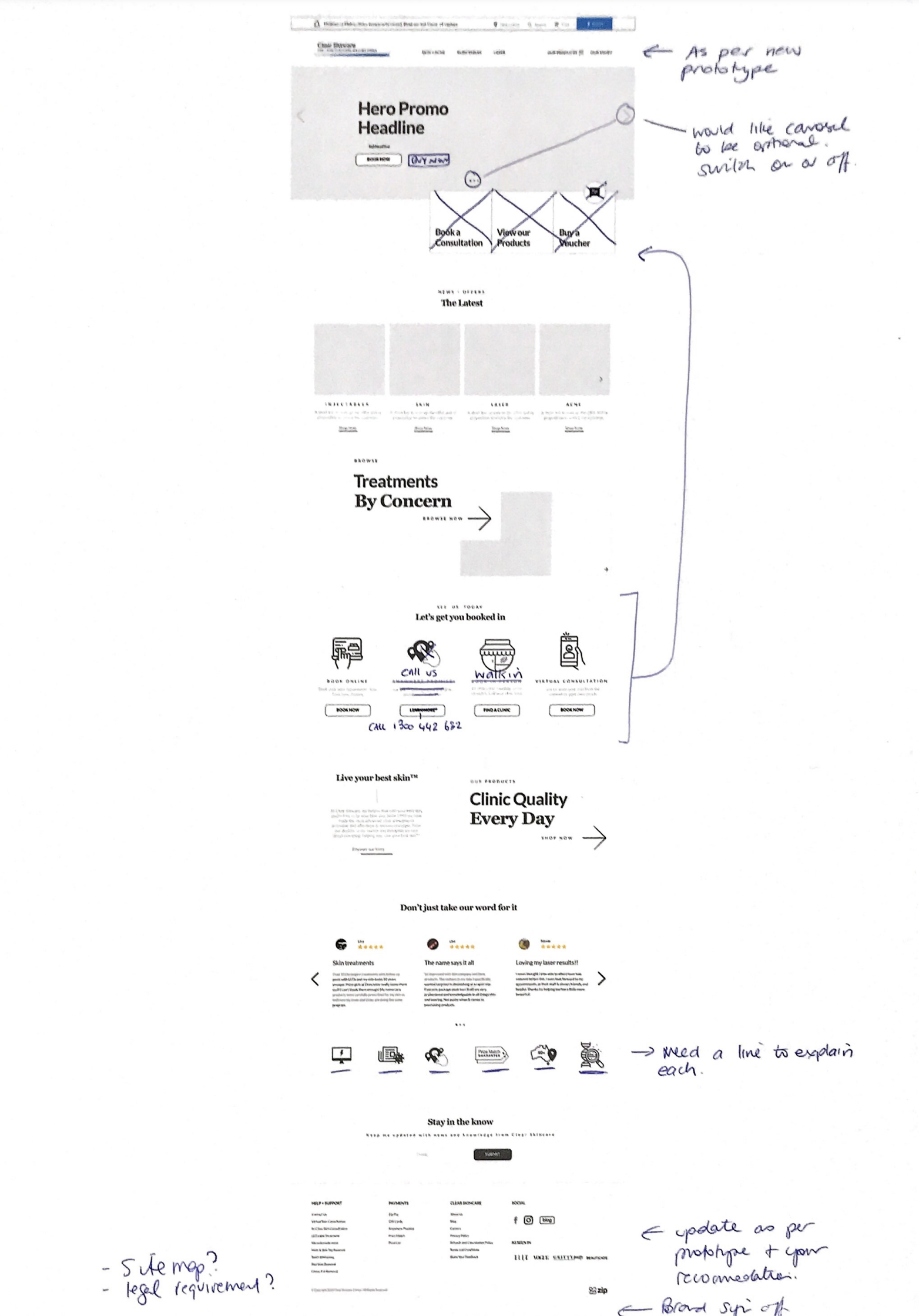

Hi-Fi Desktop Wireframes

Lo-Fi Mobile wireframe
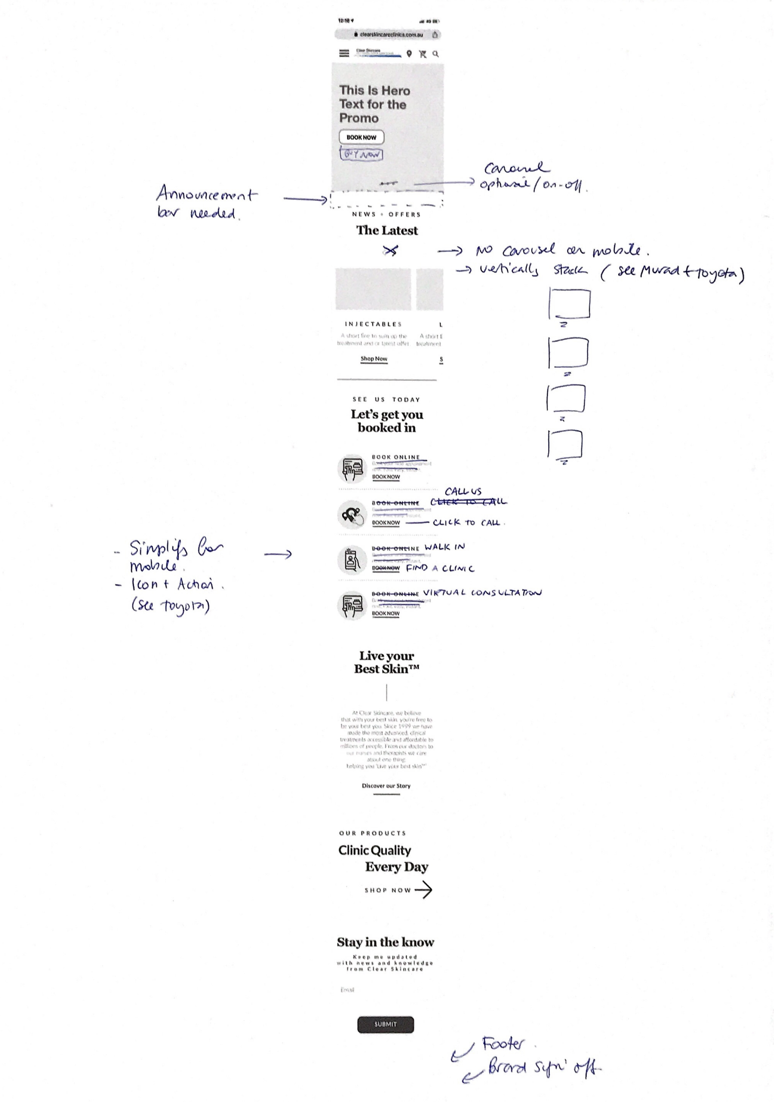

Button States and micro-interactions
Icon Library
Homepage Styleguide
Mega Nav Menu Prototypes
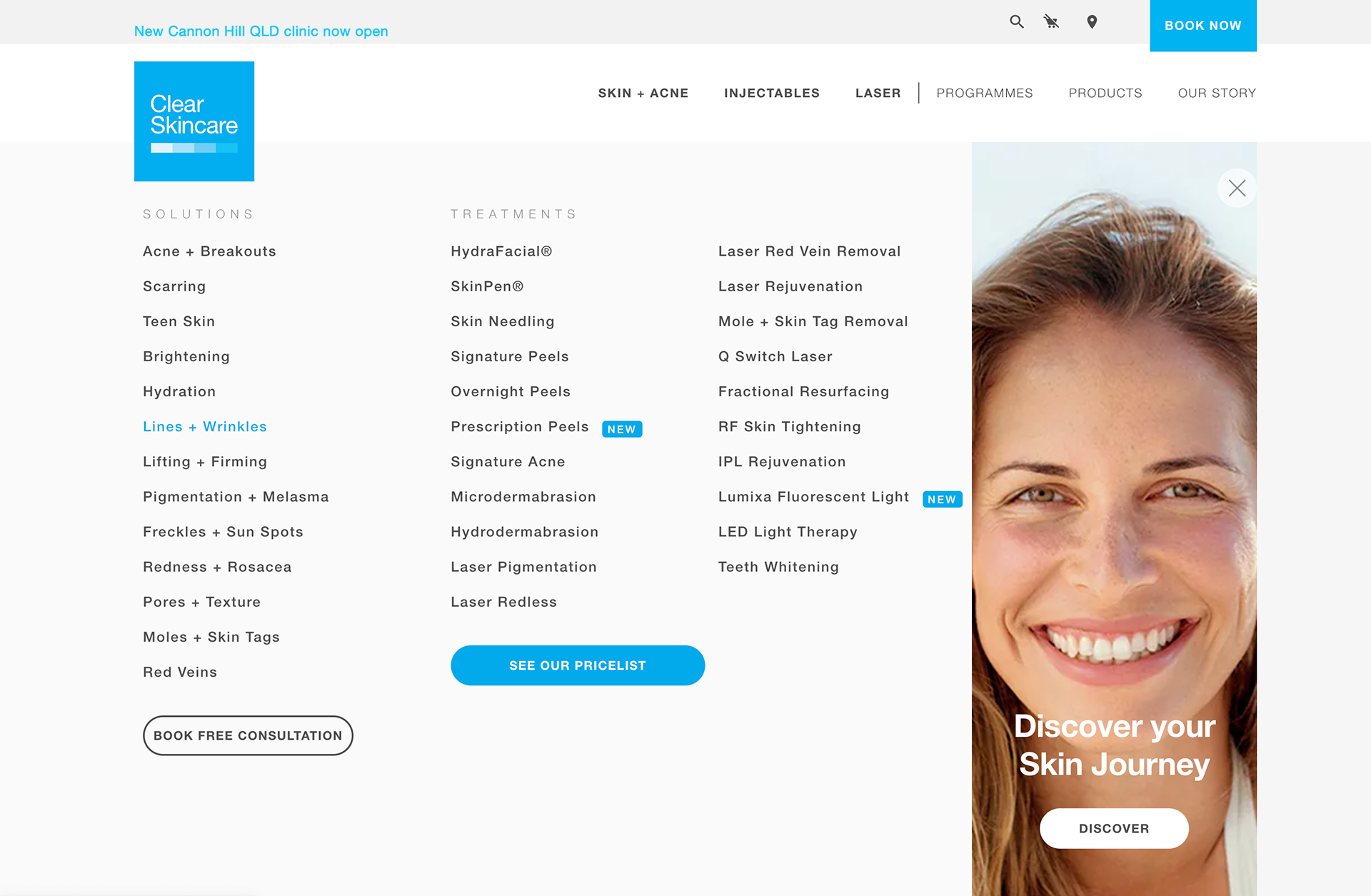

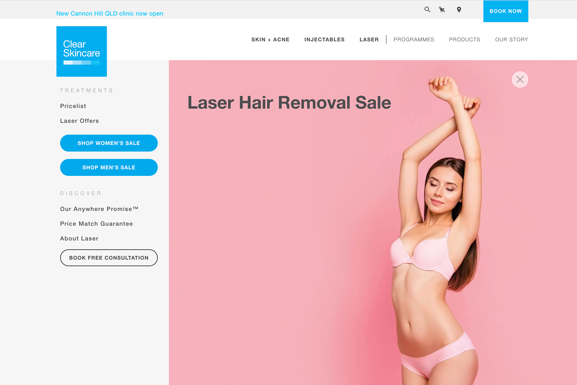
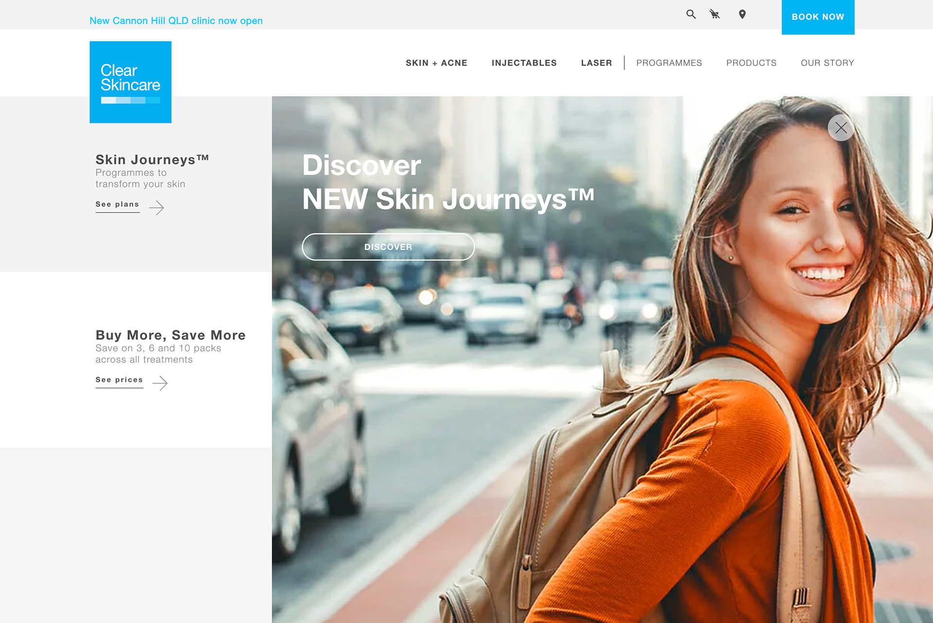
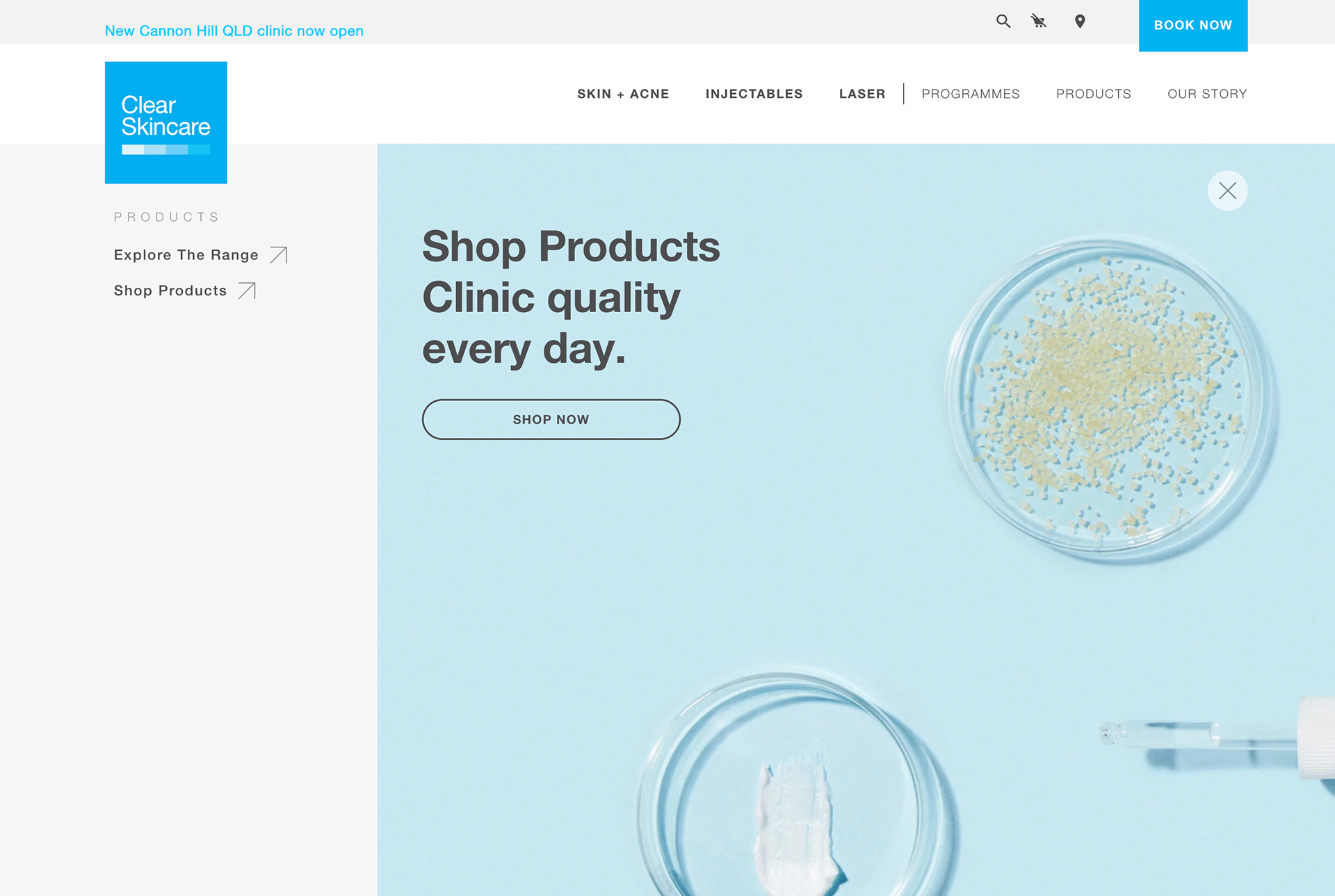
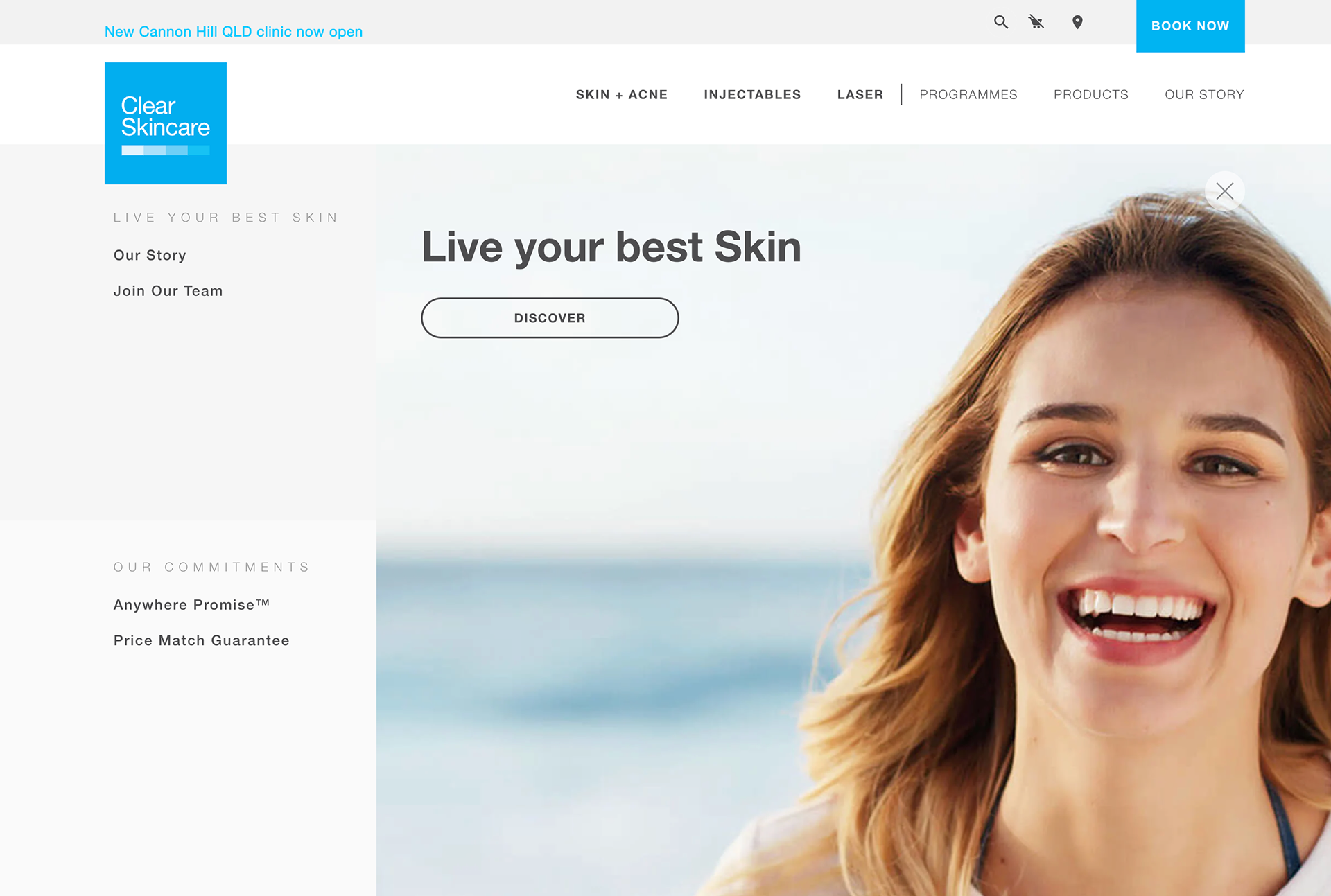
Lo-fi Mobile Prototype
Hi-Fidelity Mobile Mega Nav Screens
Phase 2:
Treatment & Concern Page Templates (Process & Solution):
1. Template Design with Reusable Modules: Leveraging the Atomic Design System and the established library of reusable modules, we designed new templates for treatment and concern pages. This allowed us to quickly assemble page layouts using pre-designed and tested components, ensuring consistency and reducing development time. The reusability of modules also ensured that any updates to a module would be reflected across all pages using it, simplifying maintenance.
2. Content Migration & Optimisation: Content was migrated to the new templates and further optimised for SEO and readability.


Phase 2 Results
Treatment Pages:
Pageviews +12.8%, time on page +22.2% (80.90s, above industry average), exit rate -1.1%, page value +97.8%.
Concern Pages:
Pageviews +43.3%, time on page +215.5% (78.57s, above industry average), page value +202.4%.
Key Takeaways
• Addressed key user pain points by implementing a mobile-first design and intuitive navigation, enabling users to easily discover relevant treatments based on their specific skin concerns.
• Information Architecture & Content Strategy: Contributed to restructuring information architecture and creating compelling, SEO-friendly content.
• Implemented a scalable Atomic Design System with a focus on creating reusable modules, leading to increased design and development efficiency, consistency, and maintainability across the entire website.
• Collaborated effectively within a team using an agile approach.
• Measured results and demonstrated the positive impact of design decisions across both phases.
• Demonstrated understanding of managing a multi-phased project, ensuring consistency and building upon previous work.
